-
We’re all about the throwback. Our company strives to bring nostalgic childhood experiences among older audiences or creating new experiences with younger ones. With the revival of the lo-fi 8-bit aesthetic mixed with the contemporary resource of insects for protein, Byxies is a familiar experience that we’ve missed, made from the past and created for the future.
-
Byxies are a mulberry filled yogurt covered snack, mixed with the Bombyx Mori moth’s pupae, also known as the silkworm. This protein filled snack hardly tastes anything like worms though, and more like the plant that the pupae feeds on! Hence the scientific name, The name Byxies comes from the word “Bombyx” and “bites,” as these snacks are pixel-sized bites of sweetness!
-
Due to livestock increasing our carbon footprint, scientists and brands have started thinking about incorporating entomophagy into our diets.
We are trying to achieve a de-stigmatization by creating a product that contains bugs (silkworms.) We will make a product that is tasteful, playful in design, and that caters to young, curious, or adventurous audiences. This is why our product is advertised as a fruit and protein filled yogurt bite, and in colorful packaging.
-
With our endearing mascot, bold purple color palette, and sweet taste is heavily catered towards children, particularly ones that love video games and technology. The nostalgic aesthetic to early computer pixel games and similar feel to other late yogurt fruit snacks would also cater to the ever-curious young adults missing a taste of childhood.
-
Nope! Our snacks do not taste like silkworms, but rather have the slightest hint of its flavor-profile, which is the smooth, buttery taste and mouthfeel that compliments well with the fruit and yogurt goodness.

BYXIES!8-BERRY BITE SUSTAINABLE SNACKS
DES 116 class at UC Davis, California
S P R I N G 2 0 2 1

LOGO SPECIFICATIONS
Early logo brainstorming, primary and secondary logos, and logo usage

EARLY LOGO SKETCHES
Challenges that I had to consider were the following:
Was the logo going to focus on imagery or customized typefaces?
Would it have a serif or sans serif font?
Which of the following designs would be most appealing to our target audience?

LOGO DEVELOPMENT
-

ROUND 1: Mascot or Typography?
Since our brand would focus on younger audiences, we were looking for playful design.
-

ROUND 2: destigmatization
People often dislike insects, even more worms. Our brand wanted to de-stigmatize the Bombyx Mori by making our mascot as cute as possible.
-

ROUND 3: PIXELS AND VECTORS
The pixel appearance in fig. (c) would later be the one we’d make final adjustments on.


brand + business system specifications
What are the parameters of my design? What components show what is “on-brand?” What would Byxies look like if we were to professionally contact consumers or other business ventures?
-
![]()
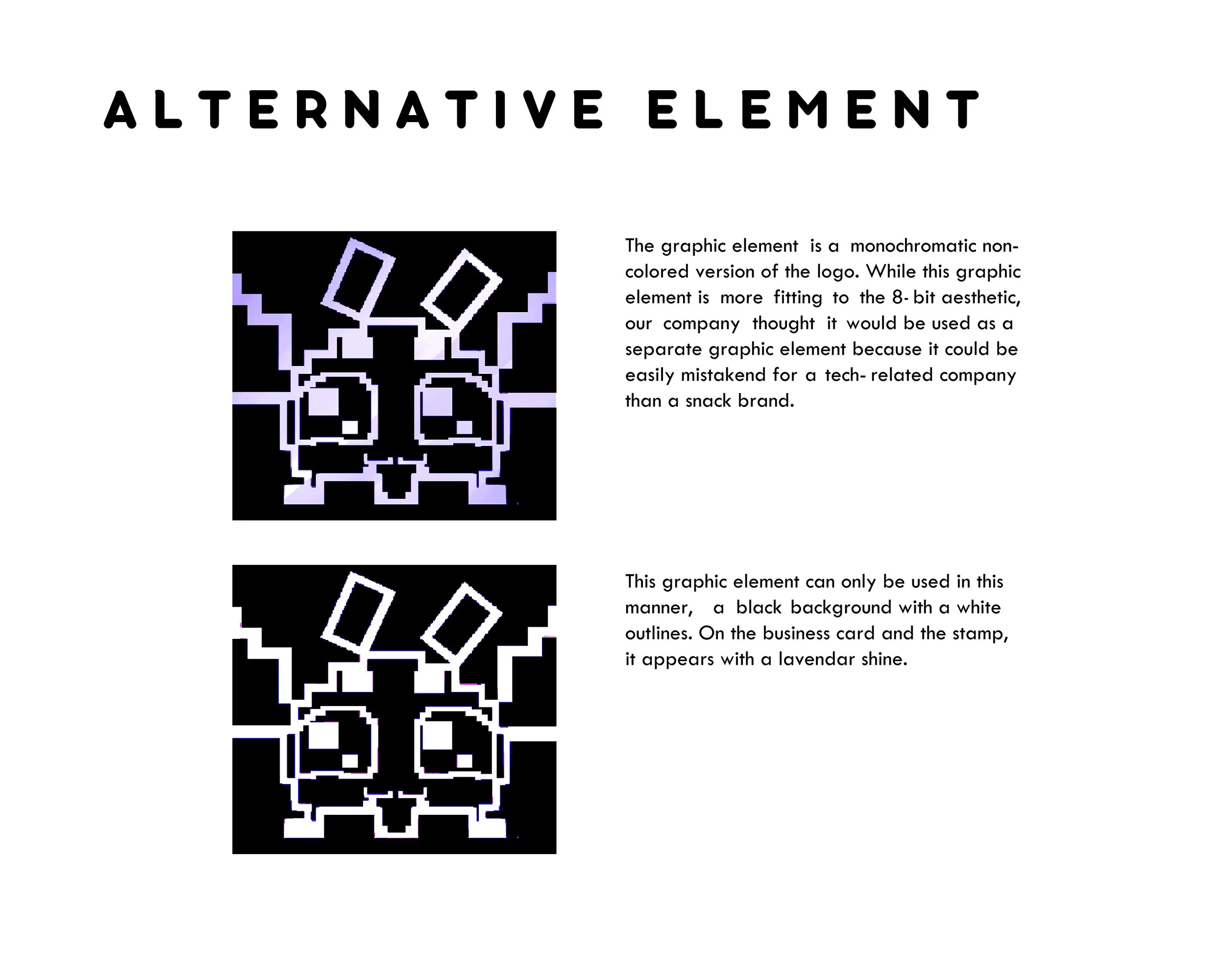
Alternative Element
-
![]()
Typography
-
![]()
Color Palette
-
![]()
Main Pattern
-
![]()
Pattern Variants
-
![]()
Letterhead/ Envelope Set
-
![]()
Business Card


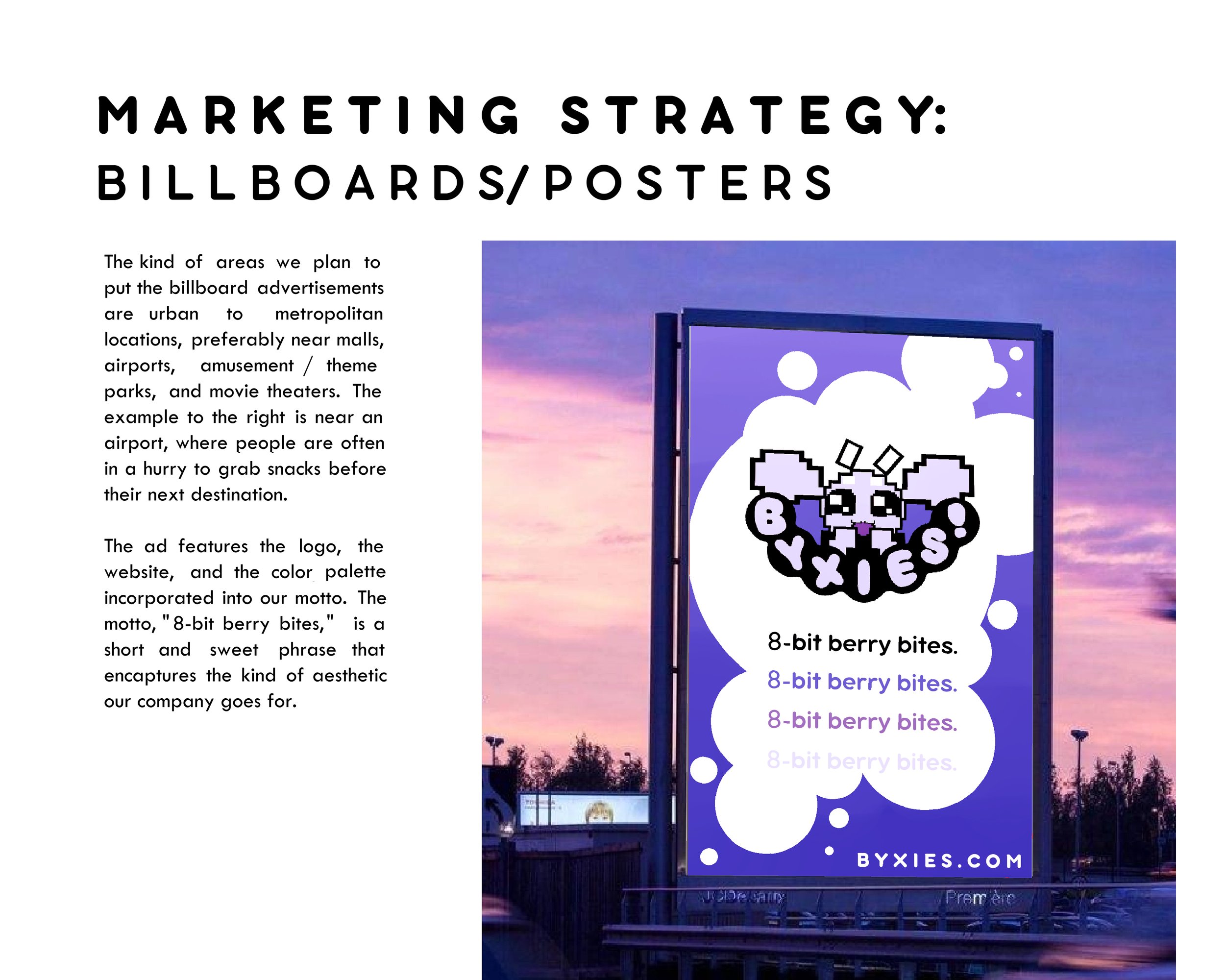
marketing strategy
What would be appealing to my audience? What about other outside of the target demographic?

-

Online games and merch
-

inexpensive merch
-

Accessories/Apparel


-

The Concept of byxies packaging
The hexagonal but geometric circular shape was inspired off of origami and 3D poly vector graphics. This packaging shape to us was most appropriate to our brand’s aesthetic.
-

future considerations
Our brand prides itself on sustainability and for our products to be 100% recyclable /compostable. The inside of the packaging would either be covered in beeswax or have an edible rice paper wrapping.